
Interaction Redesigned:
Highlights & Appended Comments
Role - UX/UI Designer
Skills Sharpened - User research, competitor analysis, sketching, ideation, UI, problem solving, project management
Teammates - 1
Status - Ideation and Discovery
Summary
Set on better incorporating user-generated content (UGC) into the site — like making community comments and contributions searchable, sortable, discoverable, accountable, SEO friendly and intertwined with the site content itself — leadership leaned on me to ideate, pitch, and collaborate on building an entirely unique user experience for our most engaged readers.
I sought out to build a new, native community tool; one that is smart, flexible and takes all of the great UGC that users share and integrates it right into the website, ultimately, creating a more holistic end-to-end reader experience for users. In the process, I became a sharper ideater, more creative problem solver and more confident presenter to project stakeholders.
If you notice some sections that are abbreviated that’s because this project is still ongoing.
Context
Where we started
Travelers like to hear from fellow travelers before they make purchase decisions, just as online shoppers, future students or prospective employees like to read reviews before they do the same.
Information from experts only goes so far; people like to hear from other, likeminded people about their experiences with just about any given product before they spend their hard-earned cash on it. Readers of The Points Guy are no exception, but they have a problem doing so.
With nowhere onsite to learn from fellow readers other than a toxic, dysfunctional comment section, users leave to find websites that foster this kind of learning.
As corporate leadership seeks to reposition the TPG brand in the new decade and develop an authenticated, premium user experience, it was time to build something to deliver users the holistic site experience they’ve been asking for. One that not only promotes quality user-generated content (UGC), but one that, by doing so, facilitates easier, more intuitive learning for other users, too.
TPG did have a place for users to share information—two dedicated platforms, in fact—but neither accomplished what leadership wanted or what users had been asking for. One of them, Disqus, was used on site; the other, a collection of specialized Facebook Groups, were used for everyone else.
Existing Community Platforms
Disqus
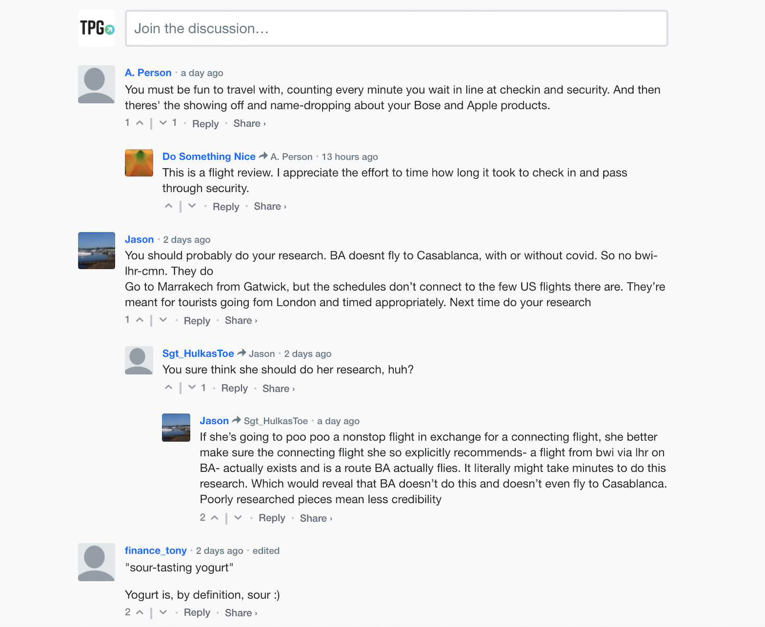
The Disqus platform provides a plug and play comment section for readers to share thoughts, experiences and questions, used on media sites across the web. This worked in TPG’s early days when the website was a blog; however, Disqus doesn’t scale well. Comments are disconnected from the rest of the site — even those that provided thoughtful information and tips existed solely in the comment section of the page that they were on, with no way to search or sort them. Even worse, because it’s a third-party plugin, these comments were technically separate from the TPG site. Consequently, helpful anecdotes that may have helped users couldn’t be sorted or searched; they were found only by chance on a given article. The anonymity of the platform enabled toxicity and spam, requiring a heavy moderation from community managers (at the time, me).
For reference, see some examples below.


Facebook Groups
On the other hand, TPG’s actual, functioning community, its Facebook Groups (which I launched and managed for nearly 3 years), did provide a platform for user-to-user learning. However, this was only meant as an interim solution. Yes, users can discover new content and learn from each other, and my team and I had designed them to be as useful to our community as possible, but having to rely on Facebook’s algorithm meant discoveries were mere coincidental. Similar to Disqus, search is dysfunctional at best, categorization is confusing for users, and no backend customizability meant community managers and moderators had to invest significant time to moderating the content feed to keep the group usable, interesting and curated.

If you want to learn more about how I led the growth and strategy of these communities, you can read about it here.

Planning
Defining the problem & considering solutions
It was unshakably evident from my day job.
TPG community members, like shoppers with intent to purchase something from a store or online retailer, are interested in peer-to-peer learning like reviews and testimonials. They also tend to be in a hurry, and want relevant information as easily accessible as possible. Indeed UGC, like reviews and anecdotes, are just as important to making purchasing decisions as what the professional writers are saying. Here’s how I expanded on this hunch before beginning sketches or wireframes.
User Research
In short: Existing user research had shown that many of the highly-engaged users that add and read comments (onsite and in the Facebook communities) can be labeled as “maximizers” and “competitive information-seekers” who want to be “in the know”—and want to demonstrate that they are.
Many like writing about their experiences and comparing how they stack up with others. The current community platforms allow users to do this, but only in the short term; users can’t discover them later unless they stumble upon them.
*Please note that this project, including user research, is still ongoing.
Problem Statement
Both community platforms, Disqus and Facebook Groups, are difficult (if not impossible) to search, save or discover specific user-generated content like testimonials, reviews or tips unless it’s by chance, making users frustrated and adding work for moderators.
In other words, readers interested in hearing from other readers have no means to find this kind of content—and those looking to share their own experiences have no way of doing so, either. Moreover, both existing communities require a significant moderation lift and, since neither is owned by TPG, neither can be customized on the backend to solve these key user problems to make thoughtful community contribution more helpful, engaging and ultimately more integrated into the site experience.
The existing communities also failed to meet one more key consideration: the possibility for a premium (aka, paid) user experience.
I started thinking broadly about how to solve this problem.
How might we…
Responsibly leverage user-generated content to supplement site info?
Amplify users’ personal experiences to give users a holistic learning experience?
Supplement article information with that from the community?
Contextualize and show how information connects to other information?
Connect user comments with article info?
Leverage community expertise and knowledge to supplement TPG content and make TPG even more of an authority through UGC & make community and commenters accountable, but also make it helpful?
Make site & community searchable, categorizable, discoverable?
Create a place where people want to participate in a positive and useful manner? Where their contributions improve content on the site without needing to add writers to get it?
Creative Inspiration
How do others tackle this problem?
How do other brands and media sites foster community and user-generated content? How do they sort and categorize it? How do they empower users to find what they’re looking for? How do they moderate community contributions and discussion boards?


Takeaways
Design something that provides readers a resource for discovering user-generated content.
Create a community that people want to belong to.
Make sure it adds content to the site: use staff & users to improve learning experience, and integrate pivotal supplemental info that is UGC.
Make sure it’s sortable, searchable and, ideally, SEO crawlable to maximize discoverability across the web.
Keep it friendly by enticing quality engagement & information-sharing through built-in moderation logic and other gamification.
Make it easy to find.
Make sure it’s scalable. Consider pay-to-play for the entire feature set to incorporate into a premium model.
Solution Overview
Design and implement a “highlight” feature where editorial staff and readers alike can highlight critical information in a given story and add their own supplemental info to it, which can be categorized, searched and discovered. Ultimately, this might create a more thoughtful, engaging and holistic learning experience—and wouldn’t require much additional burden on the editorial or community teams.
The objective was to build a new, onsite TPG community that allowed users to add their own comments and tips, while simultaneously enabling these users to consolidate, sort and integrate this information directly into the site.
*Note this is an ongoing design project. As a result, some of the information on this page, specifically the solution, might change.

Execution
Sketching, Wireframing & Solution Ideating
While this is an ongoing design project and user research is still underway, I needed to present something to the leadership team to demonstrate the opportunity this project represented, and that it was indeed worth pursuing. Thus I began sketching what this concept could look like to later present to key stakeholders in order to get the green light.
The general concept was: staff and users could highlight parts of any given article, categorize it and add their own supplemental info to it.
They could save it and/or categorize it. That way, if another user is reading later, that user can learn more right then and there.
I focused the first few rounds of sketches on what the actual highlight and comment-adding flow might look like.
Based on the problems users experienced, a small pop-up text box was a good fit. It could provide the space for contextual information about the highlight like categories and comments without inhibiting or interrupting the existing user experience too much. With scalability in mind, we would design and develop it so not every user would be able to see every highlight; only certain users (likely authenticated, premium or only those with a high enough ‘rank’ or reputation in the community) can create and view highlights and comments.

I iterated more, and fleshed out the flow for adding and reading a given comment.
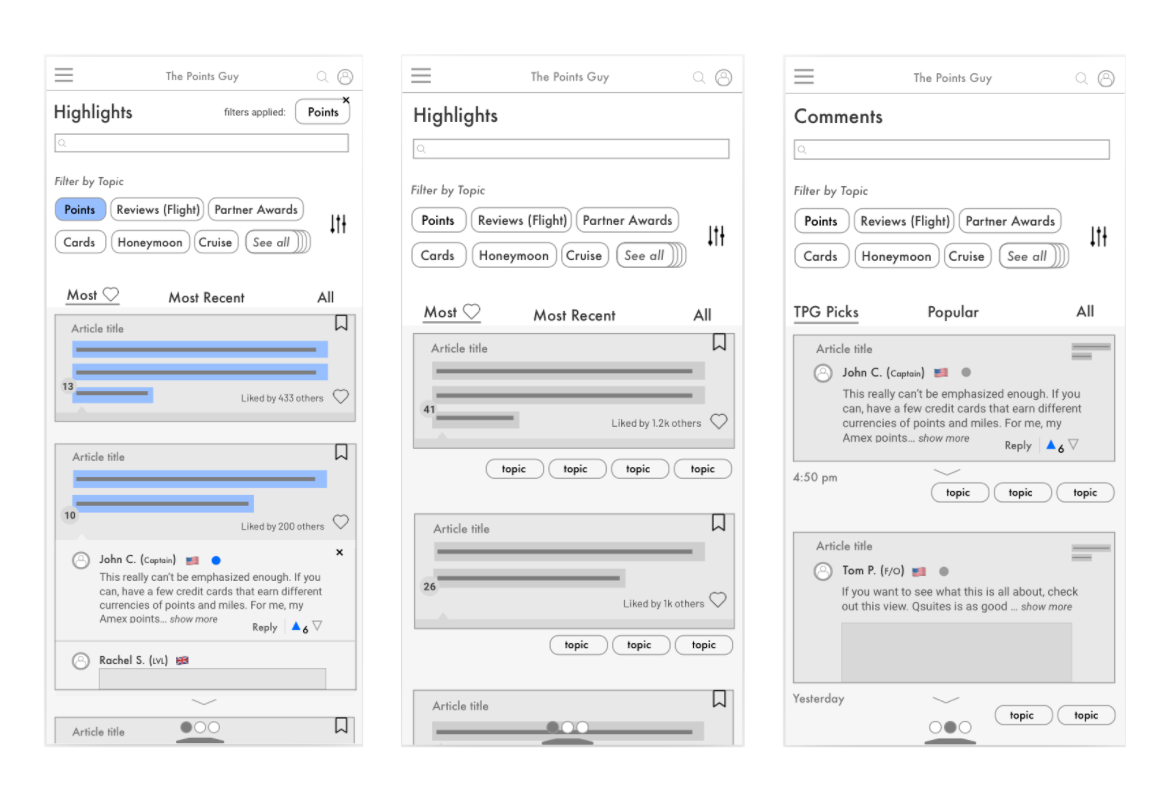
A little more polish and bam, I had the core flow of the highlight and appended comment concept, seen below.
After initial positive feedback from other community and development leads about this design, I began to refine these initial designs while adding screens to the flow.
After turning these sketches into design mocks, I had a basic flow for this highlights and appended comments concept. Once again, to show how this project might scale according to resource availability, I designed an MVP version, along with more advanced iterations.
The proposed MVP, below, would enable staff writers and editors to highlight some of the most important sentences in a given article, and categorize their highlight. Then, any given user could read the highlight (thus better understanding what information to focus on), see which topic it belonged to (thus better contextualizing the information and providing a sturdier foundation for learning more complex strategies) and even visit that topic’s hub page, where they can learn more about that topic from other related highlights in articles across the site.
Critical pieces of information in hundreds or thousands of stories site-wide would be categorized by staff and readers, and easily discovered by other users.

While the above design limits adding highlights and categories to editorial staff, a more advanced version of this design enables users to do the same and save a highlight and/or add comments to it, too. By doing so, we are providing a place for users to add supplemental information like tips and anecdotes onto the site in a way that connects their experiences to the onsite content while also leveraging categorization and keywords to make them easy to discover later.
Then, if a user wanted to learn more about a given topic, they could simply swipe down and find that in the Highlights and Comments Hub, where our user could discover key information about topics they care about by searching, adding filters or just exploring. As I see in our Facebook Groups every day, users are interested in seeing what the hot topic is for the day “what are people talking about today? What should I learn about today?” Knowing this, I included an element to sort by engagements (“likes”) or timing (ie. most recent).

This design had merits, but it was too crowded; the information hierarchy was a bit unclear.
To make it better, I expanded the search bar to further nudge users to search and discover content that they are looking for while replacing the “Filter” option to “All” to allow for better comment visibility. This is especially important for the users who may have liked how Disqus displays every comment and sought a similar experience.

With just one swipe to the left, our user could browse comments in a similar experience.
Much like the highlights hub, the comments hub displays categories, filters and a prominent search bar to make everything as discoverable as possible. To keep toxicity and flame wars away, only the “best” highlights and comments (the ones with the most likes, upvotes and from users with the highest community rank) are most visible. Notably, all comments would still “attached” to the highlight that they lived on. Again, this reinforces my commitment to contextualizing information on the page—whether that’s words from an article or stories from a reader.
Plus, all of this could be developed for a homepage “Discover” or “Highlights” widget.
For example, some of the day’s/week’s top highlights could live dynamically on the homepage (or on any page, for that matter) to improve user learning experience and foster discoverability; users could even enter articles from a highlight widget on homepage or elsewhere. Right away, a new user visiting the homepage could be introduced to the value-prop of TPG through highlights and the thoughtful contributions of its community.

To ensure users can get more in-depth as they discover new topics and the information they bring, each topic would have its own landing page, with related topics, highlights, filters and even recommended reading about that topic. SEO and editorial teams can add topic tags from within WordPress (the CMS) to keep these up to date, optimized and crawlable by Google and other search engines.
Meanwhile, a profile page would store saved highlights, articles and other site content, and is sure to “gamify” one’s rank in the community. As noted earlier, these users are competitive, so why not use that to our advantage in redesigning this experience? Quality engagements (and the upvotes that come with them) drive up one’s rank. As does one’s “Elite status,” which can be earned by completing beginner courses that I am working with another audience team to create. The higher one’s rank, the more privileges one is afforded.

More specifically, built-in moderation logic, (similar to what you see on Stack Overflow’s user privileges and Hacker News’ “flame war detector”), would reward users for good behavior, punish those for bad behavior, and ideally afford privileges and perks for the users that do the most good. This kind of self-sustaining community means less time staff needs to moderate, and more time they can continue creating the great content that brings readers to the site in the first place.
At the time of writing this, highlighting and commenting may be reserved entirely for authenticated and/or premium users.

Stakeholder Feedback:
Key stakeholders liked the concept and its approach to problem solving, particularly how it integrates UGC with site content while simultaneously makes it all discoverable and categorizable.
Auto-moderation seems scary, but a good idea. Gamification is clever way to nurture user habits around quality community contribution and engagement.
As expected, there were SEO and development questions, particularly about the tech lift required for the highlights hub, an auto-moderation system and making UGC search engine crawlable.
More user research needs to be completed to validate user needs presented.
Proof of concept necessary. Create a crawl, walk, run version of this design.
What happens next:
Ideate, iterate, prove. Continue work with UX researchers to fully capture our broader users’ needs to ensure we are actually solving their problems.
Outline the crawl, walk, run versions of this design by iterating on the core concepts presented above.
Explore premium community models to better understand user behavior and community integration.
Results

In short:
This project is currently underway.
Currently, I’m working with our design, development and community leads to assign a roadmap to this development process as the MVP version of this project is being finalized.
Stay tuned for more.
Status & Impact:
Design & development is still ongoing. Stay tuned for more.
Elimination of existing, obsolete onsite comment section as teams assess action-plan for this design proposal.
Takeaway & Lessons:
A bigger picture. Keep stakeholders in mind during ideation, even the ones you might not think are as relevant. (This seems obvious, but always important to remember!)
Space is good. Users enjoy space in their UIs, and while every design is different, ensuring text, images and other elements can breathe within any design makes for a stronger user experience, especially when there’s a lot on screen.
Learn the language. Verse yourself in the language, key performance metrics, resource requirements and shifting priorities of stakeholders during ideation to ensure the design is not only going to solve the problem, but that it’s actually feasible for the teams working on it.
What’s the lift? Indeed, an ambitious design is great in theory, but always keep the development lift in mind. The lighter the better, at least until you can prove the initial concept.
Crawl, walk, run. Similarly, design for scaling and different stages of development; at the very least, have these considerations in mind when ideating and sketching totally new design concepts.