
Conversions, Please.
An Inline Credit Card Widget Redesign
Role - Product Designer
Skills Sharpened - Research, competitor analysis, ideation, stakeholder management, business strategy, UI, Prototyping
Teammates - 3
Project Time - Two months
Summary:
Seeking to increase affiliate revenue, the TPG customer experience team sought to redesign a permanent credit card “widget” placement, located “above the fold” on nearly every page site-wide.
I worked alongside the Customer Experience, Business Development and Creative teams to lead the redesign effort for a more intuitive, more trustworthy and ultimately more impactful card widget. In the process, I became a more efficient designer with real-world experience that forced me to meet deadlines, design around business goals, and iterate based on A/B split testing.
The Context
Where we started
The Points Guy (TPG) generates revenue through a credit card affiliate network. In other words, when a user is approved for a new credit card, and used one of the official “affiliate” links on the TPG site to navigate to that card’s application page, TPG earns revenue from that card issuer.
Most cards are advertised and “sold” (aka, someone applies and is approved) through conversions like this by highlighting their perks in guide-like articles on the website. Some, however, are sold from permanent placements on the site. On the TPG homepage and on every article (10,000+ on site), there’s one of these placements: a permanent “card widget” that displays some of the most popular and lucrative travel rewards credit cards. When a user clicks on a card, they are directed to that card’s application page.
User interaction heat maps and conversion data from our Customer Experience (CE) team showed a plateauing click-through-rate (CTR) and affiliate revenue driven from this widget, something they wanted to change.
Seeking to increase card sales (conversions) from the widget, the financial, business development and CE teams sought a reimagined design.
Working closely with these teams, I would be the lead designer for this project. My task was relatively straightforward: identify “easy wins” over the old widget, and design a refreshed widget that will drive more interactions and conversions across the site.
Most users who visited the website entered from SEO—search engines like Google. A given TPG user found themselves in a given article not because of their loyalty to the TPG brand, but instead by the relevancy of that article in relation to their Google search. Often unable to find information beyond what they were immediately looking for, many users would leave right after reading the article that they arrived on.
As seen on the home page and an article page. Functioning primarily as a display ad, this “card widget” promoted some of the best travel rewards credit cards available to consumers. Upon clicking on one of these card images, users would be redirected to an application page, and if approved, TPG would receive a commission from this conversion. The goal to increase interaction and conversions.
The plan was to:
Gather user behavior insight from Data Science, SEO and Customer Experience (CE) teams and creative inspiration from around the web.
Identify “easy wins” from existing card widget; in other words, find low-lift opportunities and begin executing on design solutions.
Iterate on these solutions from feedback from Design and CE teams.
Once it’s built, A/B split test the old and new designs to identify which generates higher interaction and revenue through more credit card conversions.

Planning
Problem-setting & creative inspiration
The then-current card display widget, below, was in need of an update, and I was excited to leverage user behavior data, brand content and business strategy to design a more effective widget.
Credit card conversions were the key business objective of the project.
While a massive redesign was tempting, discipline was key. No kidding, this project required design discipline that made a lasting impact in my process going forward: with critical requirements from credit card issuers on displaying their cards (e.g. image size mandates, visibility of “bonus” points awarded and ensuring room for a disclaimer of our partner relationships), development teams (there were about a million other projects queued up for the dev team after this one) and given the highly valuable real estate that is above the fold on any website, there was truly no room for unjustified creativity. With limited room and resources to work with, every design detail needed to be particularly purposeful.
Previous testing on this widget made before this particular redesign effort indicated that the primary call-to-action (CTA) needed to include the phrase “Learn More” (this had been changed from the less-effective and more sales-y “Apply Now”)
Armed with proprietary data from our SEO and customer experience teams about the behavior of users who signed up for credit cards, the constraints outlined in the previous section, and an awareness of general design best practices, I was ready to dig into user needs.
I had another trick up my sleeve; utilizing expertise I’d attained from my then-day-job: community management, and several-years experience leading the broad TPG audience. I was excited to put these all to work.
User Research
Thanks to our larger team, I didn’t need to do this part by myself.
UX research identified some key user priorities: users are information-hungry and constantly seek to know more—they crave being on the inside track. They’re deal-hunting and they like being highly informed before making financial decisions (makes sense); they want more information, not less, just presented more clearly and in a trustworthy manner. This answered a key initial question. In other words, to entice interactions, we needed the widget to present the cards not like ads, but like what they were: curated recommendations. After further meetings with and information from our CE team, I could put together a problem statement, which read…
Problem Statement
Users don’t know (how) to engage with the existing widget because it looks like an ad, driving down interactions and conversions.
In other words, the existing widget drives low user interactions, clicks, credit card approvals because it looks like an ad and users don’t know how to engage with it. I started thinking broadly about how to solve this problem.
How might we…
Create a more cohesive user experience to the rest of the site?
Make the widget feel more educational and less ad-like?
Use stronger UX copy to encourage users to interact with the widget?
Creative Inspiration
Before starting with sketches, I looked around the web.
From competitors and other media sites, to product retailers that use widgets or modals to entice interactions and/or conversions. See a few example below.


Takeaways:
With above inspiration in mind, I then audited the existing widget to identify problems that could be easy wins, requiring minimal development work but making a real impact.
Make it fit. Create an experience that feels like it’s part of your site’s UI/UX and speaks to why users are on the site in the first place.
Speak to your audience; leverage marketing best practices to catch eyes and communicate why users should interact with the widget.
Add a clear CTA. Users aren’t going to click on something that doesn’t look clickable. Have a clear call to-action that speaks to your user’s goals.

I wanted to be sure we were sticking to TPG’s core editorial mission to be transparent in our relationship to card issuers, and making sure to include somewhere that explained why these cards are the ones we’re showing users—and possibly even what each card has to offer.
In essence, how might we make the widget—which is basically an ad—into something more in line with the other content on TPG: a guide with information that’s useful to users.
More specifically:
Provide tangible benefit(s) of card & rewards points it earns.
Use color to catch eyes.
Make entire widget clickable—or at least make it clearer where users can click.
Shy away from superlatives (they seem too sales-y).
Entice interaction by making clear the cards shown are just some of the ones on offer so users are curious to see others (and if they’re better).
Include several “batches” of cards that cycle to keep widget looking dynamic and fresh.
Make it an information hub and less like an ad.
Increase the size of the widget.
Hint at more info/insider tips/details in copy to entice interest and clicks.
Include more links to content on cards presented and the points they earn.
In short:
We wanted to make the widget more eye-catching, making clear what’s clickable, adding a strong CTA, providing more information and the value-add of each card more prominently and increasing the “deal-ness” of the cards shown while not degrading the trust of the widget or the brand.
We want users to see the cards presented for what they are: legitimately good deals, and not just a plug for card issuers.
Solution Overview
Update the widget to match the UI of the site, while adding sharper copy, useful information, expert guidance and honest transparency to give users greater trust in the cards presented by an authority (TPG), thus increasing their likelihood of applying and being approved for one. It was time to get work.

Execution
Sketching, Wireframing & Solution Ideating
Armed with how we might actually solve the conversion problem, I worked alongside our Customer Experience, Design and Financial teams to sketch and wireframe a series of refreshed widgets that addressed our key problems. More specifically, I stayed focused on the easy wins described above.
I was able to leverage my expertise in strategic communications to not only make the widget look less like an ad and more like a learning opportunity but also add language to contextualize the information and incorporate stronger, eye-catching copy.
On the first round of rough sketches, I focused mostly on how users might interact with the cards displayed on the widget, and basic ideation around what that experience might look like.
On the second round, I dug deeper: how might we use stronger UX copy to encourage users to interact with the widget and how might we make the widget feel more educational and less ad-like.
I focused on these same core concepts as I took to Sketch and began creating wireframes and low-fidelity mock ups.


More specifically, I added UX/UI elements like an original card graphic, contrast-friendly variations in color and additional information about each card to make the widget more dynamic, brand-coherent, and helpful to card-seeking users.


Stakeholder Feedback:
I could have more leeway than I realized when it came to changing the actual card image and the text elements within each card’s section.
Need to make offer bonus and CTA clearer.
What I did:
Changed button design and overall placement of cards on widget.
Updated overall UI to produce a fresher look for each card placement.
Simplified left-side design & copy.
What happened next:
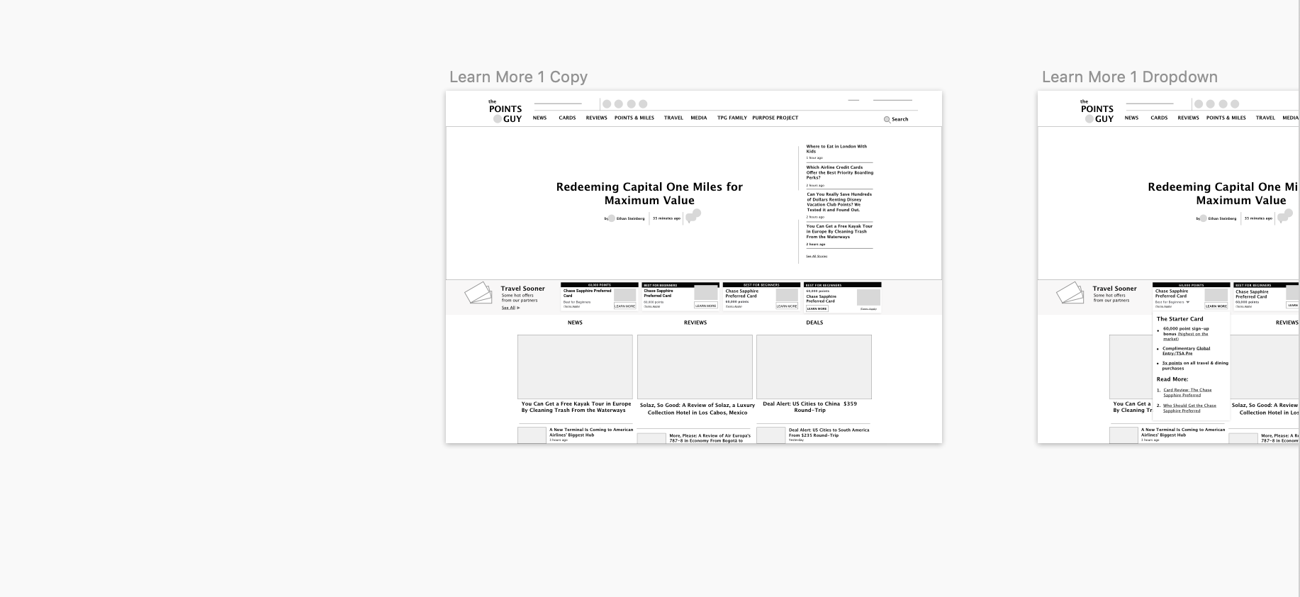
I created a few versions of the designs that I handed off to design, CE and business leadership to create high-fidelity mock ups, make final touches and pass onto the dev team. Most notably, they added a “how we choose” option to improve transparency in card selection and bolster users’ trust of the widget and the cards presented on it.
That was smart, and something I had noted in my research. As the CE team reported, the “How we choose” tooltip that explains methodology for the selection of the cards presented on the widget for enhanced credibility drove engagement. “Users began interacting with the widget a lot more.”
Results
“Extremely strong start to the new widget design, seeing a +360% lift to revenue and RPI driven by massive uptick in Clicks/Product View”

In short:
The redesign was a success. After split testing with the old widget, the new one proved to be a winner across key performance indicators (KPIs), most notably in clicks and conversions.
The widget looked less like a display ad and aesthetically more a part of the site. Color and contrast made it more modern and dynamic.
Sharper copy and CTAs demonstrated the widget’s value-add clearer than prior to the redesign (as indicated by increased clicks and conversions). The call-to-action guided user flow, and the language spoke to our information-hungry users’ by encouraging user learning, while bolstering brand authority and trust with the inclusion of the “How we choose” option.
Yes, we didn’t end up implementing some of the more ambitious designs, but I was pleased with the result, especially compared to where we had started (additional information about the cards was better saved for the card pages, I was told).
Immediately, it was a clear winner over the old design.
Users clicked on this new widget. In fact, clicks and conversions increased by hundreds of percent in the beginning, and down the road too.
Later that year, both a global site UI update and ongoing site testing led to further iteration upon this design, leading to the one you can find on the site today.
No kidding, iteration works. The current widget is even better than the one I created. Still, the impact of the collaborative design process shared above, including the original mocks and those “easy wins” I outlined, are undeniably evident in today’s current money-making credit card widget design.


Impact:
Huge uptick in product clicks, interaction and page views, and interaction with the “How we Chose” tooltips.
More specifically: “The new widget design [saw] a +440% lift to revenue … on the widget primarily driven by major increase in Clicks/Product View… overall netting to a +7% increase in total revenue to the test.”
There is “interaction with the “How we choose” tooltip… [and] high conversion from users that do interact with this element.”
Status:
Live on the site since Spring, 2019. A global site UI update, and ongoing testing from the CE team led to further iterations upon my design to arrive at what you see today.
Takeaway & Lessons:
Communication is key. Even when it’s not the “goal,” sharp UX copy can make or break a design, especially if users don’t necessarily have to engage with the design in the first place.
Be trustworthy. If you present information, be sure to show your source(s) and even why the information is there in the first place. If a user wants to learn more, make that experience seamless.
Prioritize, simplify. Don’t get carried away with designs; remember to stay focused on the objective, particularly the careful balancing act of user, business and brand.
Nudge users. Invisibly guide them to have confidence to make their own decisions within your design. In this case, a clear CTA with researched-backed copy made a huge difference and focused the user experience.