

Learning Reimagined:
The TPG Learning Center
(User Experience Design, Final Project, Feb. 2019)
Role - UX Designer (as a General Assembly student)
Skills Sharpened - UX strategy, design thinking, user research, affinity mapping, sketching, wireframing, prototyping, usability testing, Sketch, InVision.
Teammates - None
Project Time - 2 months
Summary
The Points Guy (TPG), known for its thorough coverage of points & miles, credit cards, aviation and travel offers a one-size-fits-all experience for all users.
Unsurprisingly, all of that content, from credit cards and points-earning strategies to flight reviews and travel tips, is a lot for new readers, especially given the different reasons they visit the site. In a project for a UX Design course, I researched and designed a solution for users to get the information that they wanted faster, and in the process, turned my design hobby into a practical skill set.
Please note that this project was completed for a course titled “User Experience Design” instructed at General Assembly’s New York City campus in early 2019.
Context
Where we started

One size fits all. It’s understandable given the resources you need to build an authenticated experience, but it can be limiting, in some cases severely.
According to the slogan, TPG is for those who want to “maximize your travel.”
Upon arriving on the site, users can expect to find thousands upon thousands of detailed articles about how to most strategically earn and use airline, hotel and credit card points and miles. Other content, like flight and hotel reviews, travel guides and aviation news supplement this core piece (to use points to travel more affordably) to help readers make financial and travel decisions that best suit them.
Indeed, the onsite content as a whole site is very much tied to a given reader’s personal preference, and it falls on that reader to sort through and decide what is for them and what isn’t.
In other words, the site is one-size-fits-all, and lacks authentication and personalization entirely.
As a result, feeling overwhelmed and lost, users (particularly newer, beginner-level ones) interested in learning about points and using them for travel, would leave the site quickly after arriving. Time to problem solve.
So, the plan was to…
Research. Conduct user interviews to better understand existing experience.
Problem-set. Sort and synthesize user problems to identify core problem(s) to solve.
Execute. Sketch, wireframe possible solutions.
Test. Conduct usability testing, iterate.

Planning
User interviews, problem-setting & creative inspiration
To capture the scope of problems with learning on the current site…
I made sure to interview users across the experience and visit-intent spectrum: some deal-seekers, some points and miles novices who wanted to learn, plus others who visited the site frequently for news and deals.

User interviews
Here’s a summary of my findings after interviewing users of the then-existing TPG experience.
Users, especially beginner/intermediate ones:
Didn’t know how to “play the points game” but wanted to learn.
Were overwhelmed by the number of articles on the site, and had no logical way to categorize them.
Couldn’t find information relevant specifically to them.
Didn’t know where to go for additional information after reading an article, in particular beginner/introductory guides.
Would lose track of articles while/after reading them.
Despite their expertise level in points and miles and travel rewards, users had relatively similar goals while on the site, and experienced similar problems in trying to accomplish them. Users were generally overview-seeking—be it about an airline loyalty program, credit card advice, or just how to “play” the points and miles “game.” That is, accrue points and redeem them for travel.
Most interviewees made clear they “don’t know what [they] don’t know.”
In other words, they knew what they wanted to achieve, but they didn’t know what they needed to learn to make it happen.
Users were generally in a hurry, and didn’t have time to wade through dozens of articles, each with thousands of words to pick out the relevant bits. They complained about seeing too many irrelevant or even redundant articles. And they thought personalization, and a step-by-step guide to accomplish their respective goals would make their learning experience far easier.

The current experience made these users feel overwhelmed, discouraged and unsatisfied by the TPG experience.
In effect, the site was doing exactly the opposite as intended: it made difficult, if not impossible, for almost anyone except experts to learn.
Most users, coming via social or organic search, would leave after reading the piece they entered on. Only the regulars would look around and explore, as others didn’t know where to start. Site data backed this up. In fact, users knew they had a lot to learn, but didn’t know where to go for it. Search was basically unusable and no one could make sense of the laughably confusing navigation.
Personas
User interviews and data had laid the problem bare: users had similar but ultimately distinct intentions in visiting the site, and every single one I interviewed experienced feeling overwhelmed and lost on each site visit. They lamented about the broken search function, non-existent personalization, filters or a step-by-step guide to learn how to ‘play’ the points and miles game. After a round of affinity mapping, the problem became clearer:

“Eric” is our primary persona for this project.
Eric needs a way to more easily understand how to find helpful, relevant content to help him learn to “play” the points and miles game because right now it’s unclear which information applies to him, where to go for next steps, and who he can trust.”
The problem was…
Users feel lost on the site, and don’t know how to accomplish their goals—goals they hoped to learn how to achieve from TPG. I created a core persona to solve for (I had created a few, but was told I could just focus on one for this project).
Eric also needs a way to feel confident in his learning about points/miles/credit cards because the content and the learning process aren’t straightforward, and there’s too much information without direction.
Therefore, users need a way to more easily understand how to find helpful, relevant content to help them “play” the points and miles game because right now it’s unclear which information applies to them, where to go for next steps, and who they can trust.
Goal: Design a more personalized experience—one that doesn’t require authentication.
How might we…
Allow users get in the weeds while also providing a high-level overview and summary?
Customize the experience for each user based on their specific goals and financial status?
Present the information in a step-by-step way?
Creative Inspiration
How do others tackle this problem?
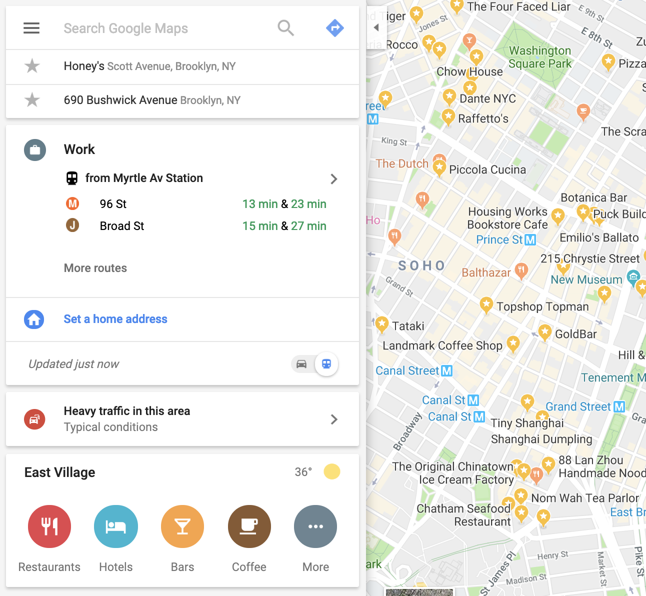
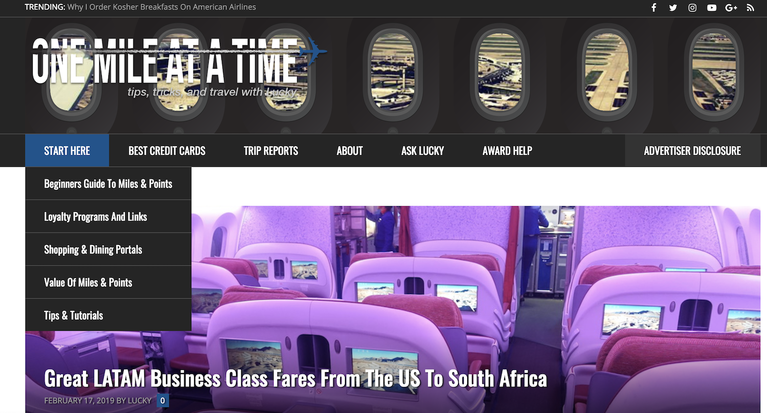
In order to design a totally new learning experience, I sought out a combination of industry competitors in the travel rewards space like One Mile at a Time and View From the Wing (since they too, had to explain to new users how to navigate the complexities of points, miles and credit cards, while communicating the value prop of their respective sites) as well as other popular content producers such as Medium, Google, Google Maps, and Netflix, seen below.


Takeaways
The above inspiration led to several important conclusions about how to design this reimagined learning experience.
Categorization affords context and situational awareness for users. As does providing minutes needed to read, etc.
Similarly, make sure users know where they are on the page. Again, context seems to help learning. Incorporating tabs into the UI will help with this (I’m betting Steve Krug would agree).
Onboarding new users/getting started content requires strong information architecture. Good IA helps users categorize further.
Related content keeps users learning. If they don’t know what they don’t know, guide them by recommending content.
Solution Overview
I was going to design a tool oriented around goals.
One that enables users to input their desired “goal” along with any additional specifications, and outputs a step by step list of relevant content that will inform them how to accomplish it.
After further ideation and sorting, I had landed on a broad solution concept.

Execution
Sketching, Wireframing & Solution Ideating
In light of user research, I chose to design for three primary goals of users:
Personalization. Let’s allow users to enter personal goals
Step-by-step. Let’s offer step-by-step guidance to help users understand how to achieve their goal.
Context. Providing context about why they were reading what they were reading and where to go for related content if they want more.
From a brand standpoint, it was important that TPG be seen as an authority in the space, but I wanted to go further to tap into the emotional mind of newer users: “Let us be the experts and let us guide you through this admittedly complex learning process to make something incredible happen.”
The earliest design iterations I came up with centered around a filtering process. I knew this probably wouldn’t be the final design, but it was important to ideate around how filters might work to allow better content customization.

Ultimately, to reduce the overwhelmed feeling users reported about the site’s current experience, I chose to break the design into basically two main sections: input (user inputs goals) & output (site generates checklist for how to make it happen).
More specifically, I chose to create a funnel-style design for the Input page. That is, users would start broad and enter a goal.
If they wanted to get more specific (for example, some users had more specific goals in mind than others—like redeeming points to fly, but only for business class and not economy), they could do that, too. These “get more specific” elements would only appear after entering that primary, overarching goal (we don’t want to overwhelm anyone!). Users could even enter specific brands as well (like Delta or Southwest).
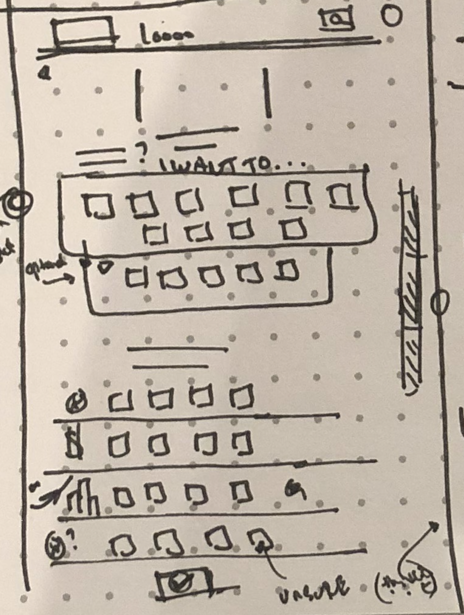

If they wanted to get more specific (for example, some users had more specific goals in mind than others—like redeeming points to fly, but only for business class and not economy), they could do that, too. These “get more specific” elements would only appear after entering that primary, overarching goal (we don’t want to overwhelm anyone!). Users could even enter specific brands as well (like Delta or Southwest).
To improve the quality and relevance of the Output (aka, the step-by-step list of recommended content), the bottom of the input page asked users for basic financial information, like existing credit cards or points.
This would address another fundamental headache for users: too much irrelevant or repetitive content. Someone looking to redeem Chase points for an economy flight to Amsterdam doesn’t care about cruises in the Caribbean. I imagined this second Input section would appear grayed out until the user completed the first Input section. This way, the design encourages users to focus on one step at a time.
Lastly, I chose to redesign the overall navigation of the website, using a tabbing system to help users better keep track of how the content they were reading related to the rest of the content on the site — something users expressed in interviews.
Once I had landed on the first iteration design, I needed to conduct a card sort to be sure the names for each of the goals made sense and were intuitive for users (I’ve grabbed just a few of the results, which you can see below).


After this research, I designed the first true iteration of the Learning Center flow.
On the first screen, users would select one of ten goals. They could get more specific if they choose—and even select a brand (airline, loyalty program, credit card issuer, etc.) to further specify. Below, they could enter some information about their spending habits, interest in family travel and any credit cards they have to better personalize and reduce redundancy in the results. I was sure to include a note about why we were asking for this financial information to ease user concerns about privacy.


The results page, which you can see below, (I’ve broken these images up into two screens since it would require an onsite scroll) included a sticky high-level overview that filled in as users “checked off” the circles on the left so user would never lose context or their place in the process. Notably, their status on the the track to complete their “goal” fills in so they don’t lose sight of their place in the process process.
Above the fold, each “step” included at least one piece of content pulled from the site (via categorization on the backend) that would act to inform users, first by laying foundational groundwork, then some details, and then finally how to execute on what they’ve learned.
Users could also save each goal, each piece of content within the list, and, in case they’ve seen it before they could refresh the result for something new but still relevant to that step in relation to the goal.


Below the fold, we provided the cards that could make it happen (aka the points you might need to book that flight), and I even included why they’re on the list—context is king here. Users could theoretically click through to these cards apply from this directly if they wanted to,
Since in interviews users reported not knowing what to do next, I designed a “Looking Forward” window where the results page would provide a selection of options (again, created and stored on the back end) for what users need to watch for. That is, how can they make their goal happen even beyond what this output page of steps and content show.
These wires were lower fidelity, but I wanted to test the flow before dedicating more time updating the UI design. So, it was time for usability testing.
Usability Testing
Did the flow work as designed? Did users feel they had more control over their learning experience? Was the information presented in a way that made sense? The primary purpose was to get feedback on this design: does it solve (at least some of) the problems users noted in interviews?
User feedback:
The first round of usability testing showed that users really liked being able to select a goal and see a step by step process.
Users said the process of choosing a goal was a tad confusing with no icons or visual cues — users complained that they had trouble scanning the input page.
They had trouble knowing where to look on the results page, and wanted more articles to read for each step.
Some also reported still feeling overwhelmed by the results “output” page. I clearly still had some work to do.
What I did:
It was clear I needed to address the input, but more so the output (result) page’s visual hierarchy and add some more content options to it.
So, I updated the UI to improve overall content hierarchy and presentation clarity and made each step on the Output collapsable to improve scannability.
I made some other small changes to enhance flow.
The results were promising…
Starting off on the homepage, which is designed with categories and a tabbed system so users don’t lose track of where they are on the site (and how content relates to each other). A bright bar promoting the new learning experience should catch users’ eyes — and would enable site teams to split-test a new widget style design (color included).

Upon clicking on the tab, users would see the new TPG Learning Center experience, where they could select a goal. The financial information section of the page stayed hidden until users interacted with this first input. In its place are popular guides that could be use to any (newer) user.
The updated output page had stronger visual hierarchy, including the ability to expand and collapse sections, specifically designed to prevent users from feeling overwhelmed.
A proper check circle replaced the step icon, which I moved closer to the step name. That plus extra space, sharper copy and color detail made this iteration ultimately more successful.

I then added two more screens…
Next steps. Solving for “what do I do next,” I designed a “next steps” screen that promoted related goals so users could continue to advance their knowledge by using the Learning Center.
Login prompt. If a user were to click on the bookmark “Save Goal” they would be prompted to login, thus making the core functionality in this experience available to any user, but providing a tease for what they could do if they were to authenticate.
Although it was a bit outside of the scope of this project, I took to create lower-fidelity designs of what a saved “My Lists” page might look like, complete with saved goals, saved articles, a favorites menu and an Instagram Story-like notification system for updates to users’ favorite brands.
User feedback:
With these modifications, users were much happier. They reported feeling relieved to have some of the content curation done for them, especially the numerical steps provided. They also liked the ability to go deeper into a particular step. In general, they reported feeling much more capable to figure out what they needed to learn to accomplish their goals, and had a positive impression of the TPG brand and its value-add.
Still, there was some work to do. Users reported that the “high level overview” was still somewhat confusing, that the page could be less cluttered, and that the information presented within each step could be condensed, although they appreciated having their chosen goal as a sticky at the top to reference back to while reading.


Results
In short:
After presenting this project and its prototype at General Assembly’s New York HQ, design professionals applauded the ambitiousness of the design: taking a wholly new approach to learning and user flow was impressive, they described. Work could be continued on visual hierarchy and flow, however.
This project isn’t finished, and that was ultimately the point. After all, I chose to redesign learning for TPG as a UX bootcamp project because I sought to gain the practical tools to research, design and actually employ it at TPG and beyond.
Impact:
Research and goal input/output structure presented in this case study are currently driving ideation for several beginner tools and new page experiences on TPG.
Provided tools for my own growth as a UX designer, particularly user research, affinity mapping and usability testing.
Status:
While just a course project, these designs have not yet been implemented onto the website.
Perhaps more importantly, however, the research findings and designs presented in this case study—particularly the goal-oriented nature of the input/output flow—have drawn attention at TPG, where I’ve been recently assigned to overhaul the beginner user experience, and will be iterating on the design decisions made in this project.
Takeaway & Lessons:
80/20 rule. Feeling in control is good for users, but make only the most important functions most visible. Otherwise, they’ll be as overwhelmed as ever.
User research. Not only did I learn how to ask better questions, but how to notice trends in common user problems.
Open mindedness in design iterating. Like any newer designer, I was confident in my original design — until I actually tested it on users. Knowing how to hear feedback, and how to iterate on existing designs proved instrumental in my design work going forward.
Visual hierarchy. Content is important, but how you present it makes all the difference. Ultimately, this project aimed to simplify complex topics; ensuring users can scan and easily digest results is critical in their experience of the design flow. Good visual hierarchy is essential to any (digital) design.
Never for nothing. While the designs on this page weren’t implemented, the research that I did, skills I honed and designs I created have impacted how the product teams at TPG think about solving for their audience, from proprietary tools and interactive courses to long term user experience design roadmaps.
Simplify when possible. I would approach the results page a little differently on another pass. I would simplify it by redesigning the “high level overview,” and each step of the results to make it cleaner, and thus more intuitive and straightforward— addressing feedback I received in user testing. I’d also give users the opportunity to customize the results within each step, to allow greater flexibility for each user’s needs. In an even more advanced version, users would benefit from a flow that allowed them to create their own lessons and share them with fellow readers, as sharing insight is a key facet of our community’s behavior.