
Spotify: Transitions Mode
Designing better hands-off playlist functionality
Role - Product Designer
Skills Sharpened - Interface design; Figma Components; Designing within an existing UI
Project Time - 2 months
Summary
Playlists are an essential component of the modern music listening experience. Spotify alone has over 4 billion of them, and millions more are added every day. Unfortunately, however, playlists remain relatively hands on. Even with features like Crossfade (a way to blend the end of one song with the beginning of the next), every song starts in the beginning and ends at the end unless a user manually skips forward. This can be particularly frustrating for the “casual DJ” who relies on streaming services like Spotify to make playlists for parties or exercising and likes to step away from their streaming device during them. In other words, this casual DJ is constantly returning to their phone or computer to change the song at just the right time for a smooth transition — or just to avoid a quiet interlude — a nuisance that ultimately keeps them from being present with whatever activity they created the playlist for in the first place.
In this case study, I explored adding custom transition functionality to Spotify’s existing mobile UI. “Transitions Mode” would empower users to set custom start and end points to any song on any playlist in advance — thereby allowing them to skip the parts they want to when it’s time, and not requiring them to drop what they are doing to do so manually. Transitions would be easy to adjust, toggle on/off and accessible from the “three-dot” song menu during playback.
After several weeks of ideation and iteration, I designed something that, at least in theory, could make music playback easier. To know for sure, I would need to test with actual users.
Ultimately, Transitions Mode could make Spotify a more usable and versatile music-playing platform.
See below for what I came up with, and read further to delve into the process. Since this is a personal project, note there are still plenty of rough edges. If you have any feedback, please send me a note, I’d love to hear from you to make my designs better!


Planning
Context
Most of us have experienced the “playlist problem.”
If you make playlists — whether they’re for exercising, cooking, reading, working, resting or partying — you probably do so you can be “hands-off.” In other words, you want to put them on and just let them play. In many cases, this works just fine. But what about the songs where you love parts of, but find some other sections out of place or disruptive? Maybe the tempo changes wildly; maybe the song just goes on for too long; maybe there’s an intro or even a skit or a story, something that makes sense as part of a larger album but not on the playlist you’ve created to fit the activity you’re doing, that throws off the momentum?
Suddenly stopping a workout routine or anxiously standing by the phone connected to the party speaker to skip to the next song to avoid the part that changes the vibe must happen all the time. Think about it: you’ve probably done it, or at least seen other people do it. It’s one of the small but omnipotent annoyances for the casual DJ — the person who likes to make playlists, but likes to leave them on shuffle, and/or doesn’t use more powerful DJ tools or apps. They rely on streaming services like Spotify and Apple Music instead.
Spotify
Spotify is the world’s largest streaming platform by number of subscribers. As of late 2020, 345 million people use Spotify — some 33% of the global audio streaming market share. With 70+ million songs available, over 4 billion playlists and many billions more of streaming minutes, Spotify is a platform made for the generalist.
Still, its once-dominant lead is shrinking. Apple Music has become a formidable competitor. Apple Music is catching up, and has already surpassed Spotify by certain metrics.
It’s not surprising. Apple is upping its game: Seamless integration with Apple products, radio and music exclusives alike are bringing the world’s richest company closer to the streaming throne.
From a product design standpoint, user experience innovation is paramount in Spotify fending off Apple Music.
This high-stakes battle for streaming dominance between Spotify and Apple leaves a window of opportunity — an opportunity to give users a reason to use Spotify instead of Apple Music. This is the primary business case for this project.
Tired of a hands-on user experience in playlist listening, I set out to define the core problem.
The problem:
Left alone, every song starts at the very beginning and ends at the very end unless a user manually skips forward. Playlists are very hands-on if a user cares about skipping certain parts of songs and/or creating a smooth transition.

Solution
Ideation
Knowing the problem (see above), I began ideating on solutions. Creating something around enabling users to customize when a given song starts and ends seemed like the best place to start.
It would be table-stakes for any UX/UI solution to be inoffensive to current Spotify users; it would need to be both easy to find, but only affect the users that want to use the feature. It would ideally keep the engineering lift low and not push away any existing Spotify users with uncalled for disruptions to how they normally use the app.
So, since I was designing a Spotify function, it was imperative to do my best to make sure this new feature’s UX/UI fit within the Spotify style as much as possible. In the earliest ideation stages, I mapped out a few key objectives of any solution by creating How Might We statements.
How might we:
Plan song transitions in advance?
Use existing Spotify UI?
Denote what has transitions (and what doesn’t)?
Make it so you can also add and edit transitions on the fly?
Save them?
Have multiple transitions per song?
Have playlist-specific transitions (not every playlist calls for the same transitions, after all)
The flow:
Though tempted to broaden the scope, I would keep the first iteration mobile-only and as focused as possible to solve the core problem.
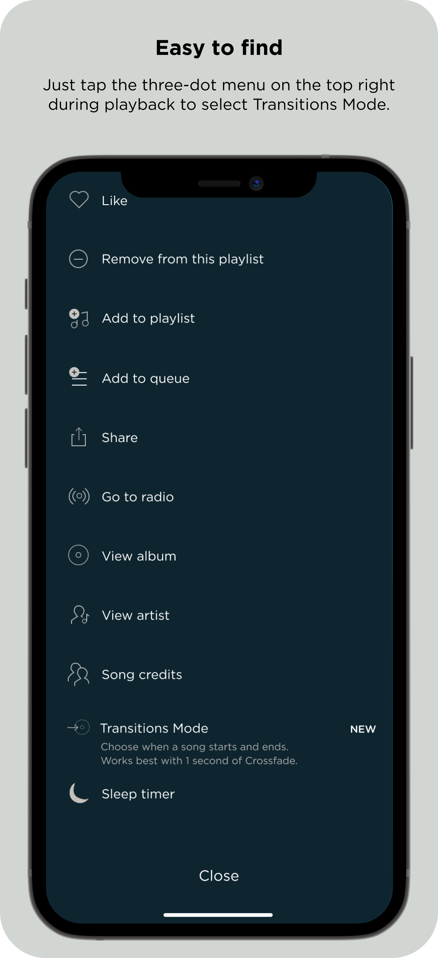
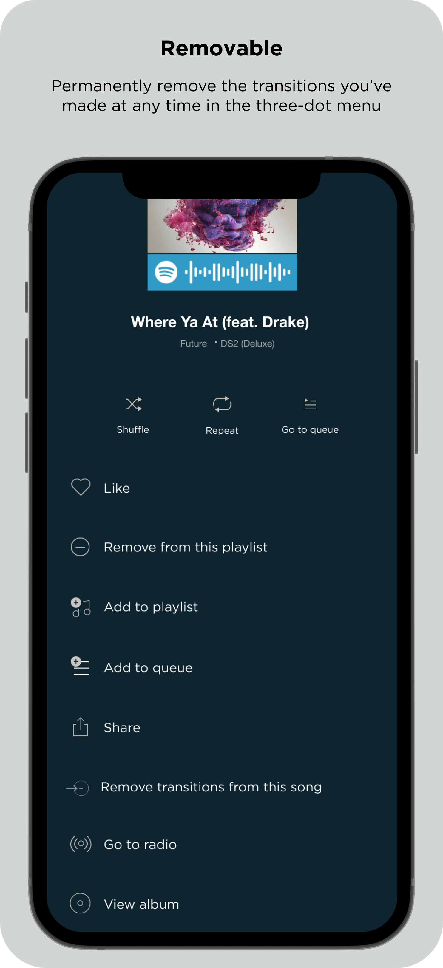
During playback of a song on any given playlist, users could tap the three-dot menu on the top right — a menu that holds numerous playback options already, like shuffle, repeat, add to/remove from playlist, share and more.*
In the menu, they could tap “set transitions” or something similar to effectively turn on this special mode.
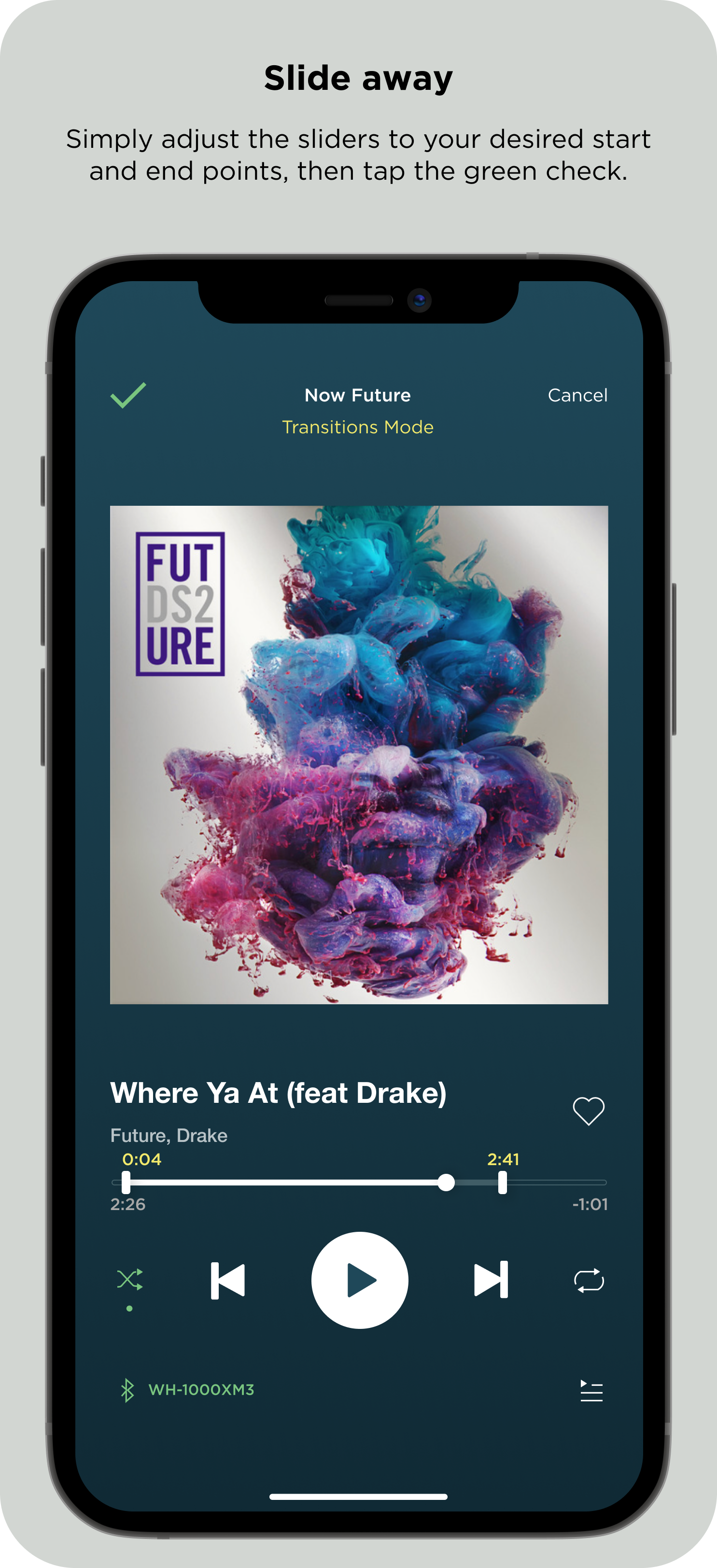
Once tapped in that menu, Spotify would show dots — or some shape that fits within the Spotify design pattern — that users could slide up and down the playback bar to set start and end times to their liking.
Playback would still work during this mode; users could play and pause music while they did this to find exactly where they wanted the song to start and end. I thought this part was key; trial and error is inevitable, and I wanted to design for it.
Once satisfied with the start/end points, users could then save their new transition points, and the song would start and end there next time it played.
*Personally, I don’t love this UX, but changing this core piece of Spotify’s current user experience was not only outside the scope of this project, it actually ran counter to my goal of quietly implementing functionality; I would leave that be, for now.
Transitions Mode would use subtle, simple additions to the Spotify UI to enable users to set custom start and end times for any song in advance and on the fly, effectively solving the “playlist problem.” As a result, it would allow them to work and workout uninterrupted, to play music at a party and be able to actually step away from their streaming device to enjoy it.
Solution
Execution
Moving into Figma, I outlined key design objectives:
Look like Spotify, which I described as: subtle, refined, minimal and neat. Spotify designs call for soft edges and muted colors.
It needed to be simple. Add as few new symbols and steps as possible; it must be easy to not see for those who don’t want to, and very usable for those that do. I wanted to create clear affordances and states.
It needed to be usable during set up, but also quickly usable during the workout, party or whatever activity the playlist is for. This was essential if it were to make things easier, not harder and solve the “playlist problem.”
Other questions remained too, like how might users toggle their new start/end points on and off with ease, and what happens if a user wants to create multiple start/end points for the same song?
After recreating Spotify’s UI in Figma as best as I could, I got to work.

The very first iterations of this were about getting something on the drawing board. I knew I wanted an in-progress color for the Transitions Mode state, when the user is modifying the song’s beginning and end points, plus clear affordances for the sliders to adjust the start and end time.
But the first real challenge was the UX; where and how could you turn this mode on and off? I studied Spotify’s existing UX patterns more closely to find a sensible place for Transitions Mode within it.
I envisioned a yellow for the Transitions Mode state to denote “under construction” or “modifying.” Still, it had to be within the Spotify brand. To find a color, I inputted Spotify’s green into Adobe’s color wheel to find a proper analogous color, which landed me, more or less, on #F2E96B.
I proceeded to outline the rest of my colors based on the Spotify UI.
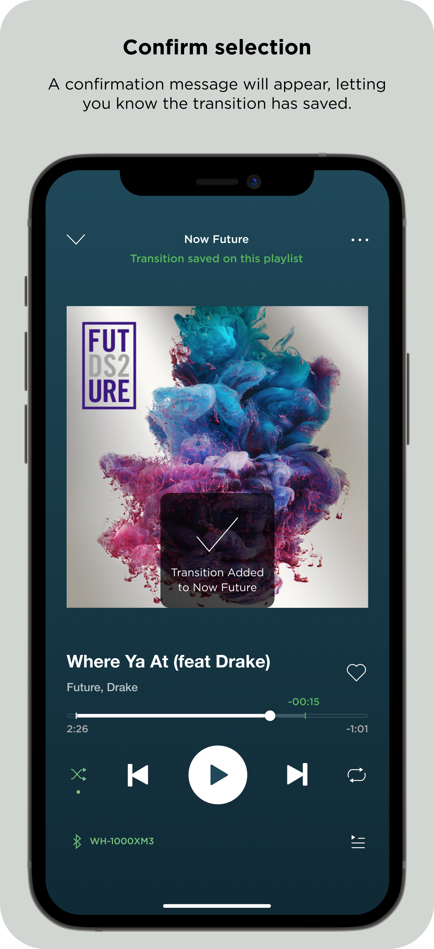
Quickly, the flow came to life. A user would enable Transitions Mode through the three-dot menu on the top right, adjust “sliders” to set their own beginning and ending points, then tap a green check mark to save their transition, or tap “Cancel” to discard them. After saving a transition, they could permanently delete it in the playback menu — the same one they used to first enable Transitions Mode for that song. I also included a status indicator on top, under the playlist name to denote the Transitions Mode state (Transitions On, Transitions Off, Transitions Mode).
Finally, in order to solve for the question about having multiple transitions per song, I decided that a song’s transition would be saved only to the playlist it was currently playing on. This would also mean users could have multiple transitions on the same song depending on the playlist, and even share playlists with transitions they’ve created, paving the way for UGC and sharing opportunities.
I spent the majority of the iteration stages adjusting the look and feel of the transition “sliders” and playback/progress bar during Transition Mode and with it enabled.
Using circles to match the Spotify theme as much as possible, I tried multiple variations of what it would look like when the sliders were active, and how the playback bar would change as users changed the start and end points. I also considered the playback time remaining: what time should it display, and where? I didn’t want to make anything permanent on the screen (like artist and song name, control elements) move at all.
Other questions arose: Would the playback bar turn entirely yellow? Would just the parts being trimmed? What would happen if the transition slider was over the actual playback dot? I didn’t want to shrink the playback bar — that seemed too destructive; I wanted it to feel adjustable and clear what had happened. I established rules for margins and when sliders overlapped with the playback “dot.”
Still, it felt off. I couldn’t image any designer at Spotify allowing the quintessential playback bar turning yellow. It felt too forced.
Then I tried something else. I removed the fill of the playback bar and thinned the stroke. What if when you adjusted the start/stop time, the playback bar effectively hallowed out, except for the parts of the songs that were going to play?
In other words, by moving the transition sliders, a user would be effectively shortening the song to their liking, to start and end wherever they prefer. This is reflected in the playback bar, moving to just a .66 pixel stroke. I cleaned it up, and liked how it looked. I also tried changing the transition sliders based on the state: During Transitions Mode they would be opaque and brighter; then, during playback, they would fade slightly to denote their existence, but that they’ve been set.
Still, there was too much yellow; it threw off the hierarchy and didn’t make sense for its purpose. It also didn’t feel like Spotify.
I tried multiple versions over the course of a few weeks. I adjusted their opacity, size and color dozens of times. I needed to reduce the yellow and simplify the design. There were also too many circles, and it felt confusing. The idea to reduce the opacity idea of the transition sliders once transitions had been set wasn’t working. It was confusing and and didn’t feel on-brand. I searched for inspiration, then it hit me.
Instead of more circles, the sliders would be small rectangles with a few-pixel border radius and shadow. Soft, simple, related to other Spotify elements but still unique, it would be used for this functionality only. These new slider shapes gave way to a much more sensible visual hierarchy, too
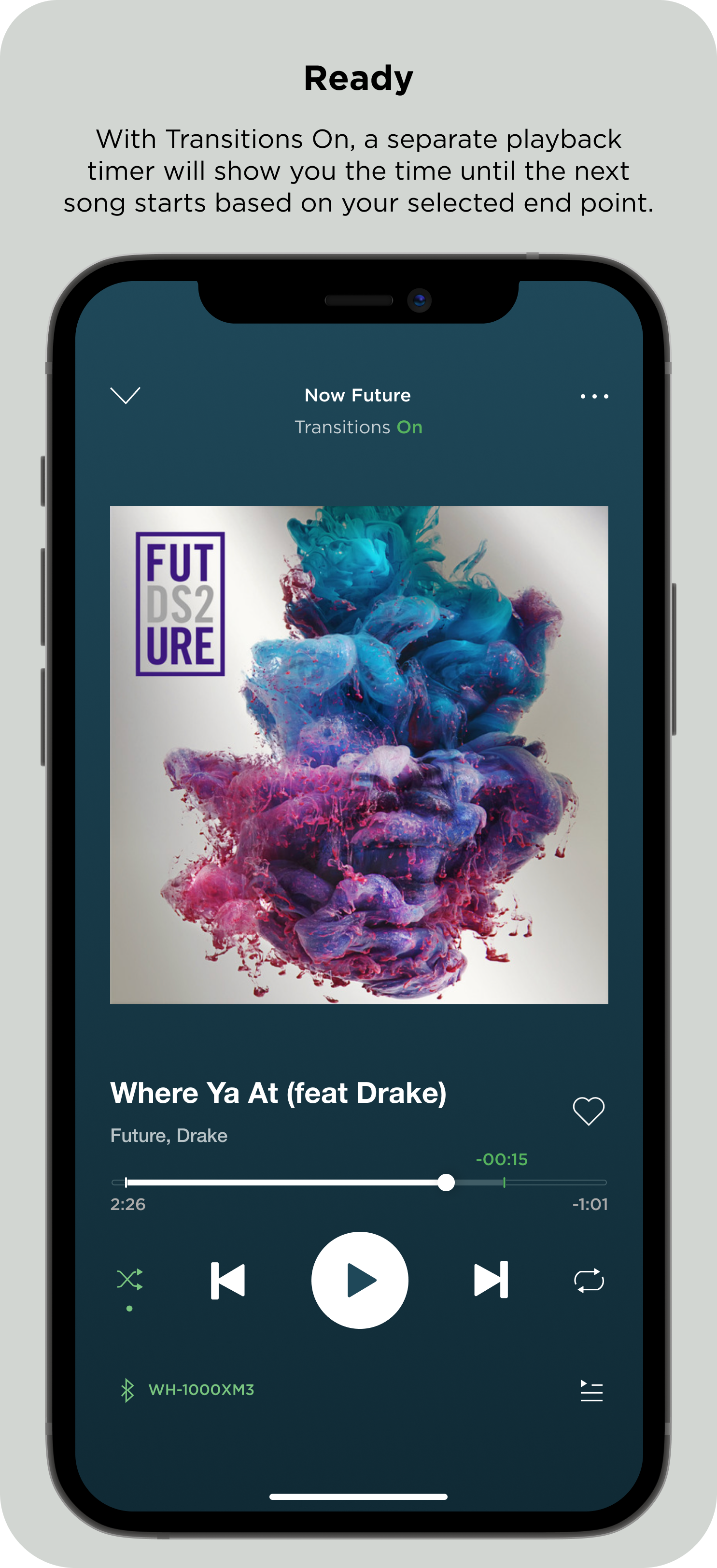
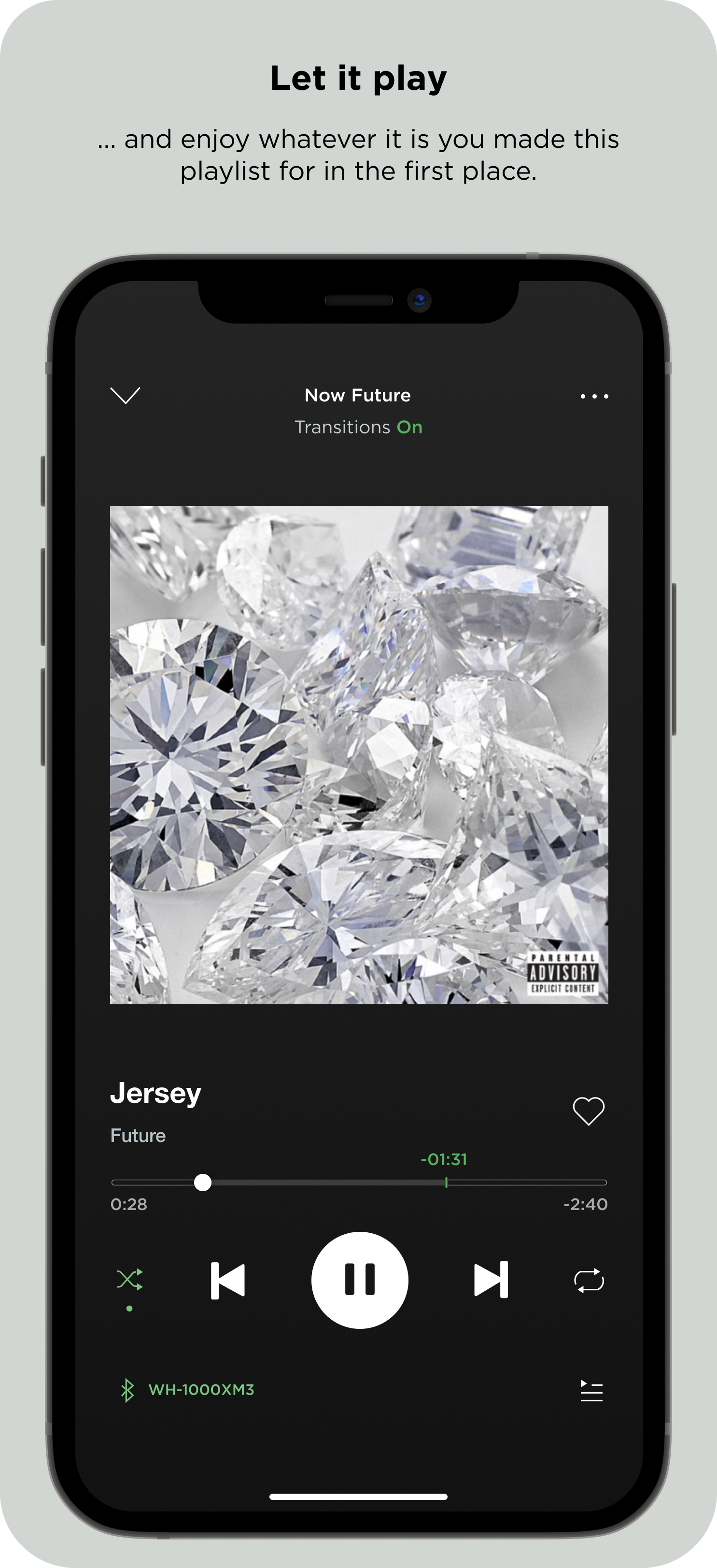
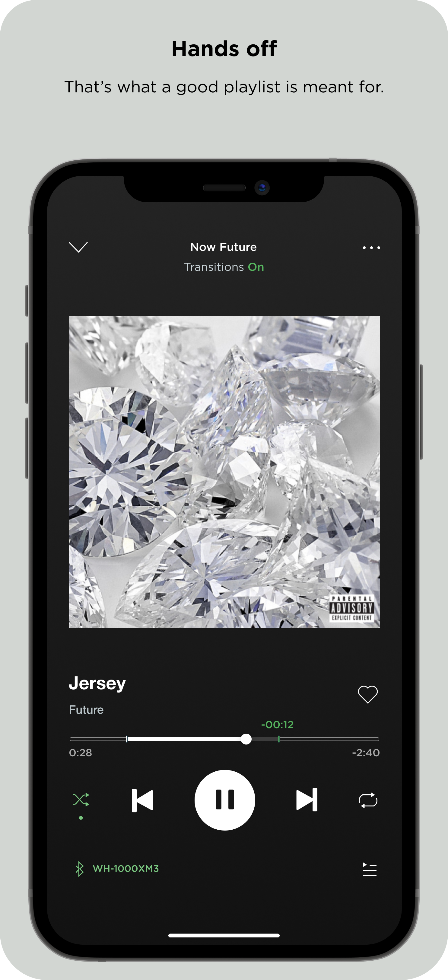
During Transitions Mode, sliders would be bigger to afford moving and visibility. Then, to demonstrate successfully-set and “On” transitions, the sliders would shrink to hash marks.


This would provide a clear affordance of Transitions Mode being active, and a second clear affordance for the successful implementation of them. During Transitions Mode, both the start and end slider would show time, then once a user sets transitions, only the time remaining would show. After all, the most important information, at least in theory, is how much time is left until the next song starts.
Soon, the colors became more logical.
I went a step further. I decided yellow would only be used during Transition Mode to indicate in-progress (or “under construction”). Then, once the user set their transitions, the song end-point and time remaining would turn green. This felt more intuitive and rewarding. It also worked better with the Spotify UI.
To ensure quick and easy use on the fly, I implemented a toggle experience enable/disable Transition Mode. I considered designing it so users could enter Transitions Mode by touching/moving the hash marks, but decided that would cause unnecessary headaches as users could accidentally touch and move them, messing up their pre-set transitions.
In this case, the deliberate step of toggling at the top made the most sense.
The toggle experience would be simple: A user could tap “Transitions” in whatever state they were in to turn transitions on or off, or tap again to seamlessly enter Transition Mode, where the hash marks once again become sliders, the time turns yellow and its format changes slightly. An “off” toggle would allow a user to disable transitions easily on the fly without deleting them. After all, if they wanted to delete a transition altogether, they could do so at any time in the three-dot menu.
At this point, Transitions Mode design felt right based on what I set out to do:
Intuitive, subtle, usable, within the Spotify design language, plus out of sight for those who don’t want it yet easily reachable for those who do. It would help a user get a playlist ready beforehand and enable them to adjust it on the fly, too.
Results


In short:
I may have solved this problem (on mobile)
With the obvious omission of validation research aside, I believe what I designed in this exploration is a plausible solution — or at least the first iteration of one — to the “playlist problem” where users must constantly interrupt the activity at hand to skip the parts of songs they don’t like; however, a desktop versions and other minor fixes plus usability testing is needed.
Built within the lines
Designing within an existing, carefully crafted design system posed the biggest challenge to this project. I believe I successfully brought the Transitions Mode concept into the Spotify design “language” in both UX and UI.
Next Steps
I’d love to continue working on this project, continue to iterate, create desktop screens and even begin usability tests to see if my solution works for Spotify users.
Transitions Mode is a subtle yet significant improvement to playlist usability
Key Takeaways
Prepare early.
Research design system elements like fonts, colors and more to ensure you don’t have to retroactively adjust this after you’ve already designed flows within Figma, Sketch, etc. Good use of components/symbols can help remedy this later on, but only up to a point.
Use Components (well).
Strategically creating components early on will allow for a more efficient ideation and iteration process later on as the project scales up. I continue to improve component library creation and design styles for my projects.
Simplify.
Regular users of complex digital products don’t want more complexity, even if your design is adding important features. In this project, I learned how to simplify better, and how to evolve a broad concept into a clean UI that fits within an existing design system. My design process — and specifically where my first sketches and designs began to where they have ended up — demonstrates this evolution.