
MYmta Redesign
Making New York City’s transit app less complicated, a case study
Role - Product Designer
Project goal - Complete homepage redesign linking to existing app flows
Skills sharpened - Design systems, conducting UX research, prototyping
Summary
Good public transportation can make or break a great city. Transit systems are expensive, and there are few cheaper ways to improve the experience of using them than to provide riders with reliable information to plan their trips.
In 2018, The New York Metropolitan Transportation Authority (MTA for short) built an all-in-one iOS and Android app, MYmta, bringing North America’s largest transit system under one virtual roof, with a wide-ranging feature set and transit integrations that put real time subway, bus and rail updates in riders’ hands.
After scouring the App Store, interviewing fellow app users and personally using MYmta regularly, I became familiar with several UX issues that got in the way of its utility. Users reported the app having many helpful features, but compared to other popular transit apps, found MYmta confusing on first use and overly complicated to navigate later on.
In this redesign, I’ve surfaced and redesigned key information such as maps, arrival times, delays/disruptions and other requested features like subway time alerts, while connecting this new homepage design to the existing app. I’ve looked to some of the most popular transit apps on the market, and integrated pieces of their winning UX/UI patterns into this public utility, while also attempting to bring New York City subway’s iconic visual style to the MTA digital experience.
Hopefully, the result of this exploration is a more intuitive MYmta experience meant for the fast-paced New Yorkers who rely on it.
Transit riders want quicker, easier access to information they rely on regularly. The goal of this project has been to offer an alternative design to MYmta to make getting around New York more intuitive and less complicated.
Planning
Context
New Yorkers like to move quickly. Riders on New York City public transit are no different. Before the COVID-19 pandemic, the MTA, the New York agency responsible for the largest public transit system in North America, moved an average of 7.7 million riders per day.
Such volume can lead to slowdowns. Planned repairs and reroutes coupled with unpredictable delays and disruptions often make subway and bus schedules unreliable, so many Metro-area residents rely on a variety of real-time transportation apps — among them Google Maps, CityMapper, Transit, Moovit and others — to plan their trips around the city. Still, these can occasionally be mistimed with the actual transit times.
Actual MYmta icon (left), proposed new icon (right) that more closely aligns with New York City subway signs.
In 2018, the MTA released an all-in-one app, MYmta.
The app would give users crucial trip information and real-time updates, straight from the source.
While successful in bringing its services under one roof, users reported problems in using some of its basic features.
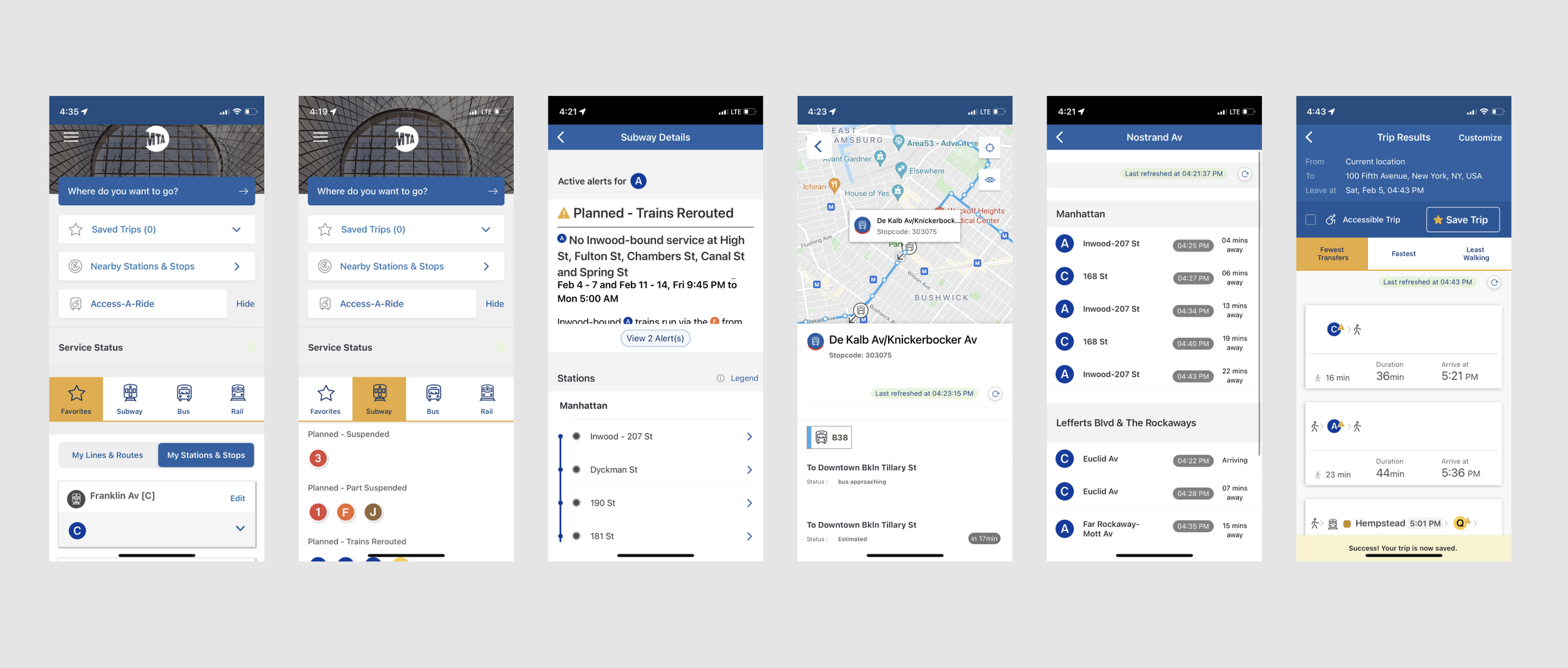
Selection of screenshots from MYmta. The two left-most are the app’s current homepage. Some of the most-used screens like train and bus arrival times and service changes (see third, fourth and fifth from left) require multiple taps and often significant scroll depth.
User research
In interviews with current app users and those sourced from the App Store, people wanted to see more, right away.
They loved seeing real-time locations of buses but had trouble deciphering service disruptions and even expressed interest in Twitter integrations with one user exclaiming “you are the source!” Total newbies to the app totally missed the trip planning call to action (CTA) and, when tasked with finding subway arrival information, asked questions like “Where do I go first? Where do I go for that information? … It’s “messy” and feels unclear.”
After identifying where that information lived, and how much information was available to them, these interviewees expressed that they wished it were easier to find and more intuitive for someone arriving on it for the first time. That made sense — after all, New York City sees tens of millions of transient visitors each year, many of whom may download this app to get around.
Public transit riders look for transparent, real-time information when planning a route or a detour, but they reported feeling lost or discouraged using an “overcomplicated” MYmta homepage.
Many riders check the MyMTA app to gauge trip times and route planning, but can’t find key information like train or bus times, delays and service updates fast enough, which makes them less likely to find the most useful features of the app and ultimately makes using the subway and bus system more more stressful.

Solution
Ideation
When it comes to knowing when the next bus or subway is arriving, every second counts, and extra steps can cause serious frustration.
Based on interviews and testimonials, riders want:
Consistent, reliable information that’s readily available.
A faster experience — fewer steps to get the info they want quickly and clearer signifiers around key feature sets to get users into the flow to find information they may not know is available to them.
Easily accessible bus timing.
Real time maps and times, not just one or the other.
More scannable service disruption information.
Control and autonomy, specifically optionally that could cater to their specific routine.
Even in the earliest sketches, solutions revolved around eliminating steps and putting more real-time information right in front of users.

The scope of this project would be to improve the existing MYmta experience through a homepage redesign. There were plenty of intuitive flows hidden beneath the surface. My job would be to make them readily available so the app is more useful to new users and those in a hurry.
Solution
Execution
The redesigned MYmta would:
1. Surface common use information that’s already available deeper in the app while also improving the information scent to key functionality.
2. Meaningfully organize and separate this information based on common user goals.
3. Make it feel like the source of truth. Add visual UI changes that, although they may not quite match the current style, could inspire more product-wide changes.
The navigation system
One of the first changes to the home screen would be how users navigate between modes of transportation. This meant changing to a more commonplace tabbed global navigation system, replacing the below…


… with a subway, bus, rail and subway & bus tab, a UX/UI style that users would immediately recognize.
I also added a “Subway & Bus” tab based on how users actually make transit decisions. If the next train is far away, it may make better timing sense to walk to a bus stop in a different direction, or vice versa. This combined tab allowed for these on-the-fly decisions.

Designing wires for everyday use
On the new homescreen, there would be five sections:
1. Live map
2. Real-time arrival times
3. Service issues
4. Static map
5. Contact & social
As a firstly, step I turned to inspiration from some of the most popular and well-reviewed map and transit apps available like Citymapper, Transit and Google Maps while refreshing on UX fundamentals like information scent and information foraging.
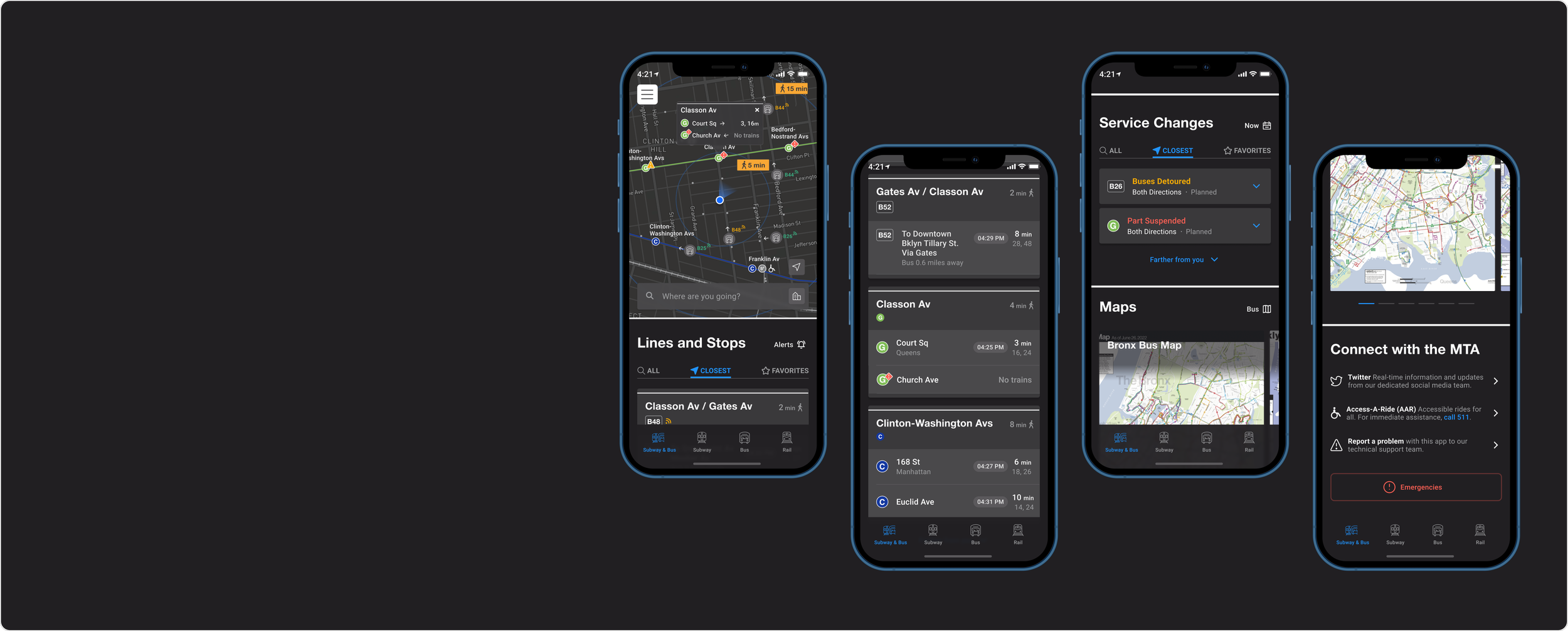
Each section would use a redesigned information card, designed to provide essential information readily available to users. These transit cards would either be expandable, or link to existing flows within the MYmta app.
There needed to be a variety of subcategories within each parent category, such as “Closest” and “Favorite” lines, or lines with service issues. A tab system helped solve for this, and allowed me to keep a variety of crucial user paths quickly reachable at immediate opening of the app.
Along with arrival time and trip planning flows, service disruptions are a significant factor in getting around. Existing notices are hard to scan, and I wanted to fix that as best as I could, emphasizing hierarchy and a more simple form structure.
Over time, through ongoing iteration, modules took form, including other flows like setting alerts and a simpler search experience.


High Fidelity Designs

To nail a uniquely New York visual style, I drew from the iconic subway signs system designed in the 1970s, and modernized in some newer city transit maps and kiosks.

The new overall visual style and design system was meant to feel like New York’s iconic transit system in a way other, more global, transit apps couldn’t.
Modules began to feel more balanced, and more uniquely New York. After all, the MYmta app isn’t meant to compete with Citymapper, Transit and Google Maps (it’s a free app provided by a government agency), but that unlocked other opportunities.
Using this system, a module library came together nicely.
1. Live Map
The goal was to give users more ways to find what they need, and fast.
Like other transit apps, an interactive, realtime map would live on the top of the page, allowing riders to find nearby stops, stations and arrival times.
2. Transit Cards
The most important information about train and bus arrival times, available as soon as you open the app.
3. Service Changes
Crucial delay and disruption information in a scannable list, including icons from the MTA and the wonderful Streamline team.
Severe delays and disruptions use a deep rep and a diamond icon (shown here), while less severe ones use a yellow color and triangle-shaped one. Having different icon shapes was important here to ensure accessibility for color blind users.
4. Static Maps
Static subway, bus and rail maps can be especially useful when out of cellular or wi-fi range (read: underground) when riders need to make transit decisions on the fly. This module takes the static maps currently found in MYmta’s hamburger menu and surfaces them on the homepage.
5. Connect with the MTA
Users wanted quick access to the MTA’s Twitter, and this provided an opportunity to surface other, high priority items like Access-A-Ride, technical issues and an emergency button.
Watch it work
A screen recording capturing some features of the prototype
Results
In short:
Simplified, quicker, more New York
By surfacing crucial transit information, this redesigned the MYmta homepage aims to make using the New York public transportation system easier. Want to use a real-time map to find your station? No problem. Prefer to browse a list of closest stops, closures and delays instead? You can do that, too. New Yorkers are about speed and style, and this newer design attempts to solve for that.
Prototyped, validated
Feel free to play around in the prototype (embedded at the top of the page, or you can access here). By building a prototype, I’ve been able to begin to validate these new designs. Users have responded positively to the new homepage, and how it connects to the existing flow. Although this new design isn’t in the hands of the many MTA riders, the ones that have used the prototype offer encouraging testimony.

This new MTA app is designed to make crucial transit information easily available for riders using it on the fly, and stylistically more closely resemble the iconic transit system it serves.